 Interactive access map
Washington, D.C.
Food Access in Washington, D.C.
SNAP-supported access gaps become clearer when mapped against poverty.
- Point data
- SNAP access
- Demographic overlay
Selected GIS Work
Interactive access map
Washington, D.C.
SNAP-supported access gaps become clearer when mapped against poverty.
 State-level rates and change
United States
Rates, change, and shelter status reveal different state-level patterns.
 Comparable-county ratio map
U.S. Counties
County-level ratios show visible disparities where comparison is possible.
Windsor, Ontario
A planning-level suitability workflow for candidate planting priority areas.
Washington, D.C. | Food access
This project compares food assistance infrastructure with economic need in Washington, D.C.
Research question: Where does food assistance access fail to align with economic need in Washington, D.C.?
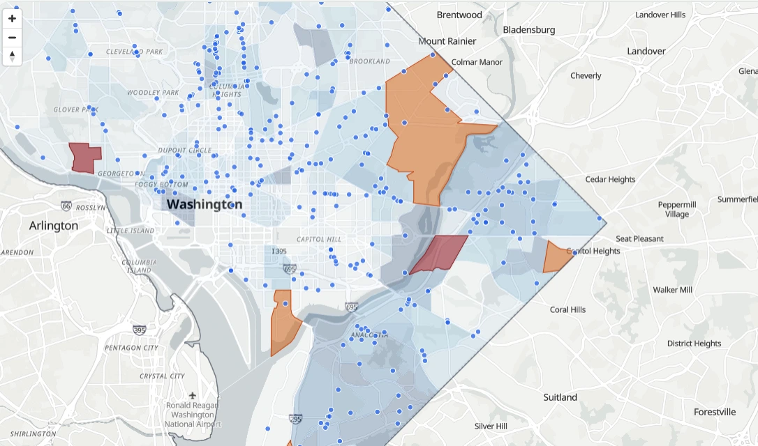
This map compares food assistance infrastructure with tract-level poverty in Washington, D.C. SNAP retailers and farmers markets show where food access points exist, while the poverty layer shows where economic need is higher. The goal is to examine whether food access aligns with the communities most likely to need it.
How to use this map: Toggle poverty, SNAP retailers, farmers markets, and candidate access gaps to compare food assistance locations against areas of higher economic need.
Interactive map using public food access, SNAP retailer, census tract, and poverty context data.
Map question: Where do food assistance locations overlap with higher-poverty census tracts?
Compare SNAP retailer locations against higher-poverty tracts. Areas with higher poverty and fewer nearby access points should be investigated further.
Limitation: This analysis uses straight-line distance from tract representative points and does not account for transportation, walkability, food price, store quality, or operating hours.
What this shows: Food access gaps matter most when they overlap with economic vulnerability. Higher-poverty areas with fewer nearby SNAP-supported retailers should be treated as candidate areas for deeper review, not as final conclusions.
Decision value: This screening map can help identify areas for SNAP retailer outreach, food access planning, or deeper network-distance analysis.
Prepare food location layers, classify SNAP-supported and non-SNAP locations, export GeoJSON, and use web mapping to communicate the difference between availability and practical access.
The web map is a screening tool for spatial patterns. The next step is to add measured network distance, transit access, or service-area analysis to better represent practical accessibility.
This project shows how food infrastructure should be evaluated against need, not mapped as locations alone.
United States | Housing | 2020-2024
This project compares state-level homelessness through count, rate, change, and unsheltered share.
Research question: How do state-level homelessness patterns change when measured by total burden, population-adjusted rate, rate change, and unsheltered share?
Key insight: The same state can look different depending on whether the question is burden, intensity, change, or shelter condition.
The following maps and charts compare homelessness by total count, population-adjusted rate, rate change, and unsheltered share.
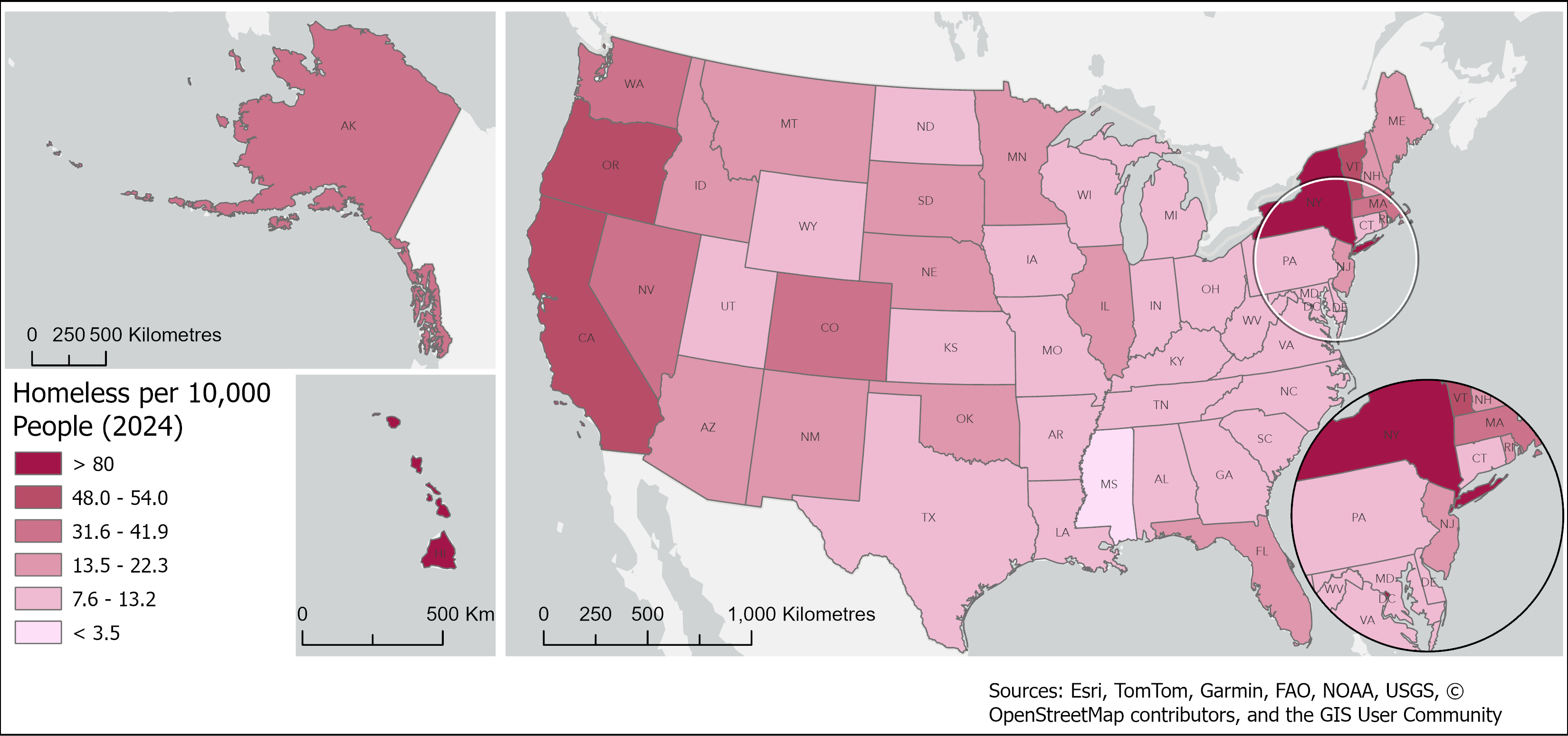
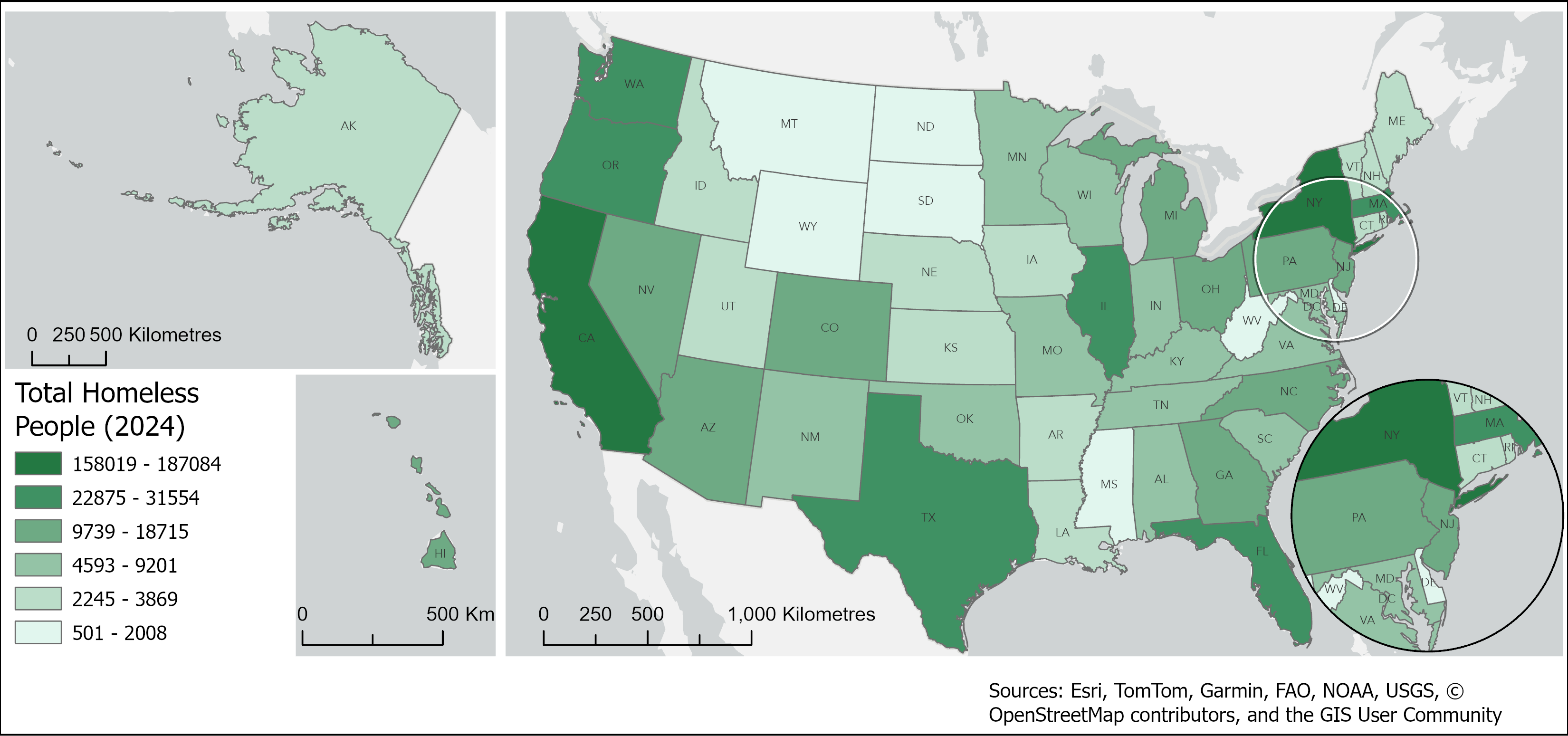
Use the slider to compare two perspectives. Total counts show where the largest number of people are experiencing homelessness, while rates show where homelessness is most intense relative to population.
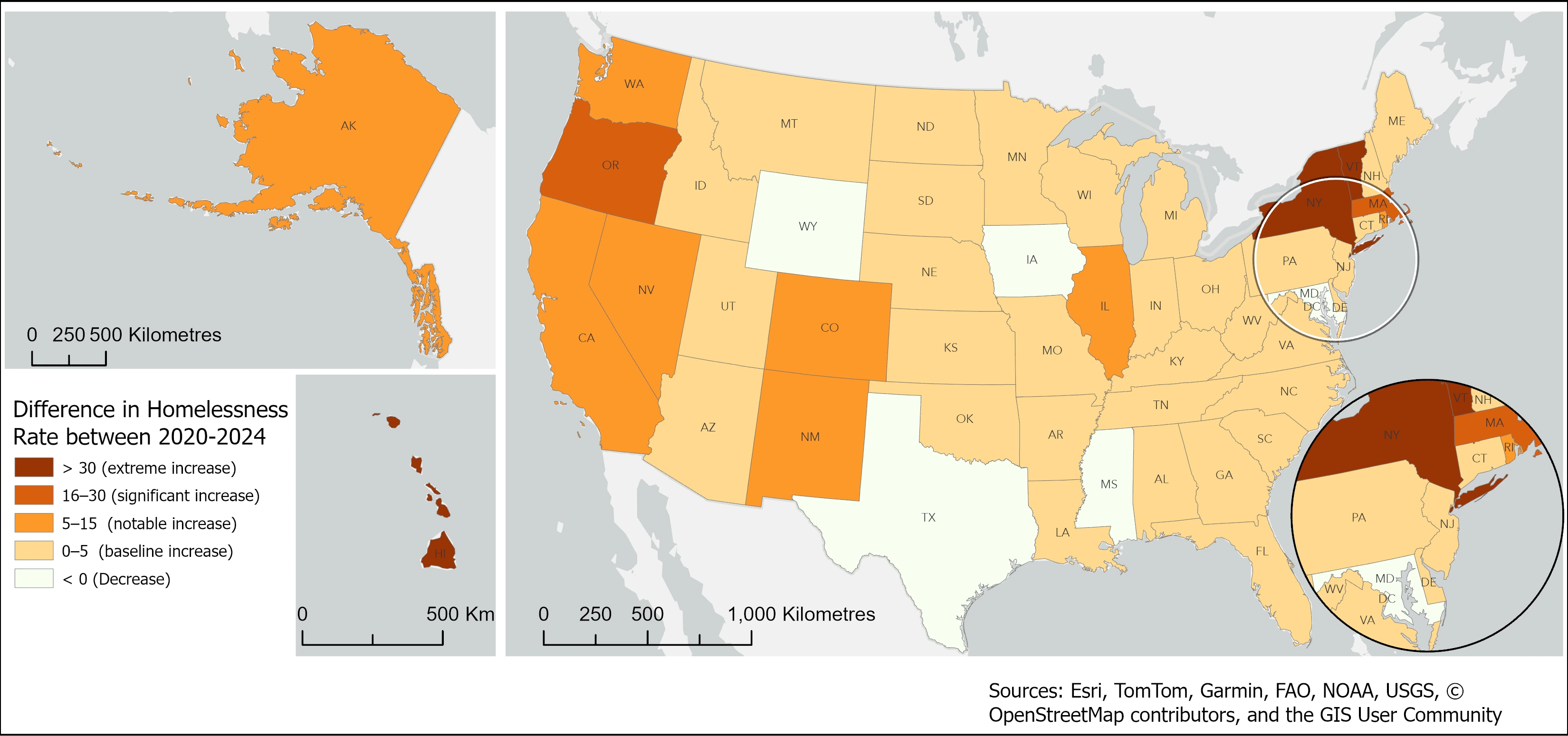
Change in homelessness rate can be read in two ways. Absolute change shows how much the rate increased or decreased, while standard deviation change shows which states stand out as unusual compared with the national pattern.
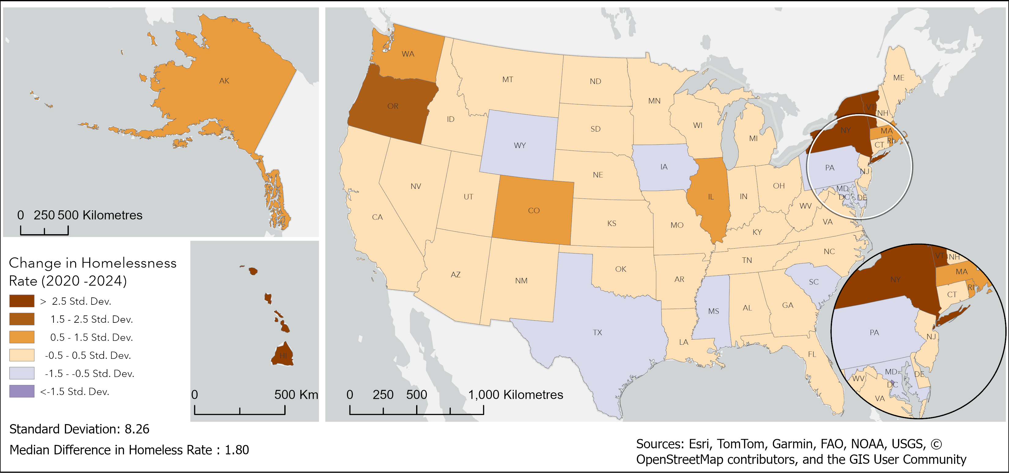
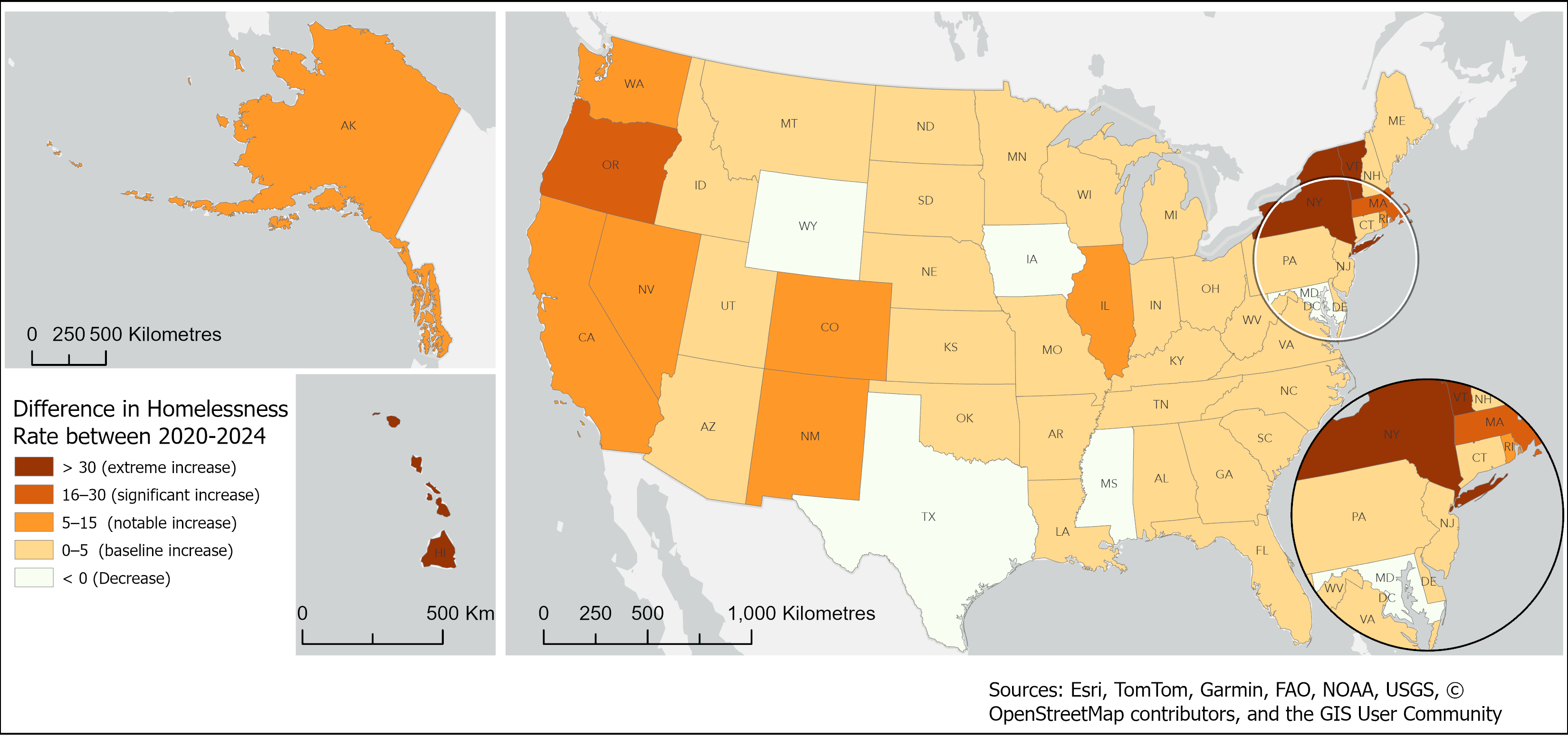
Use the slider to compare two ways of reading change. Absolute change shows where homelessness rates increased or decreased the most, while standard deviation highlights which states stand out compared with the national pattern.
Homelessness is not only a question of scale. States with similar homelessness rates can differ sharply in how homelessness is experienced. The unsheltered share shows where people are more likely to be outside the shelter system, while the bubble chart compares rate, unsheltered share, and total count together.
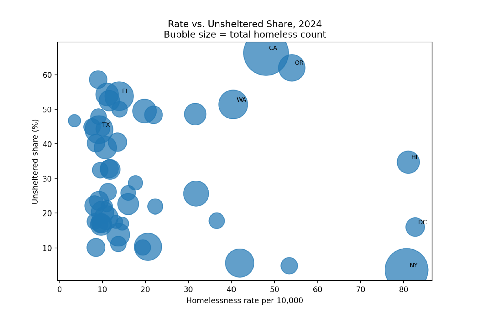
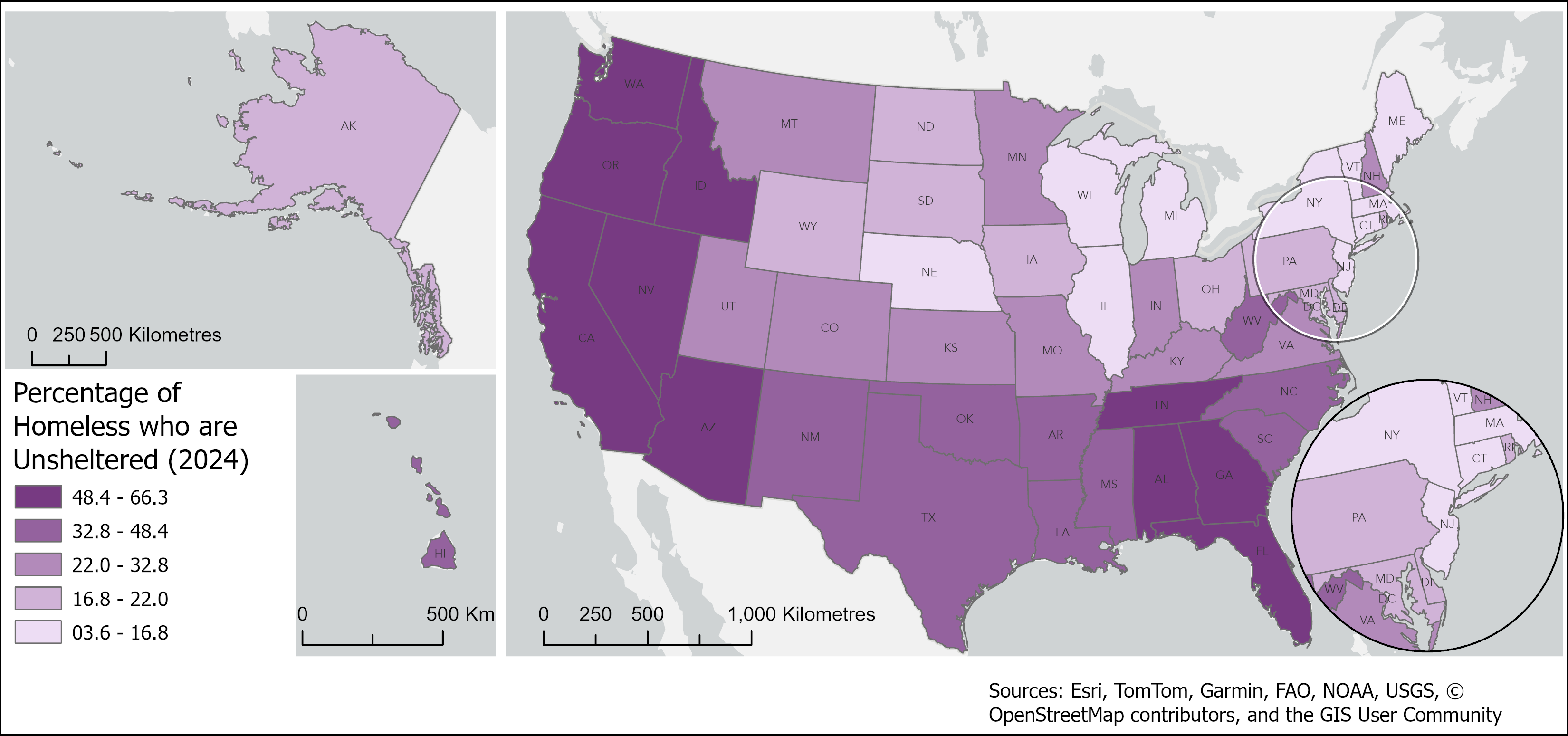
Decision value: This comparison helps separate where homelessness is largest, where it is most intense, where it is accelerating, and where shelter conditions change the policy response.
Compile state totals, calculate rates, compare 2020 and 2024 values, and prepare static maps and charts for rate, count-versus-rate, change, and unsheltered percentage.
Point-in-time counts are sensitive to local methods, timing, and definitions. Interpretation should account for differences in enumeration practices and local shelter systems.
The next step is to connect these state-level patterns to local housing supply, shelter capacity, and service-system context.
United States counties | Public health
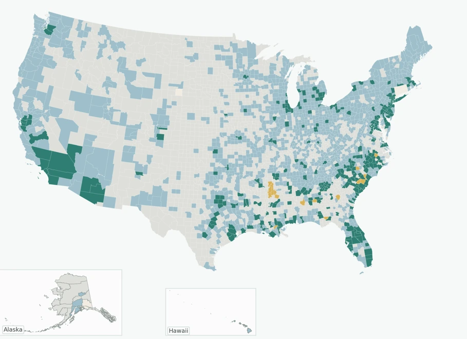
This V1 analysis maps county-level Black-to-White breast cancer mortality ratios only where both race-specific values are available.
Research question: Where can Black-to-White breast cancer mortality differences be directly compared at the county level, and what do those comparable counties reveal?
Analysis focus: A mortality ratio greater than 1 means Black mortality is higher than White mortality in that county. Dual-data counties are required because suppressed low-count data means some counties cannot be compared directly.
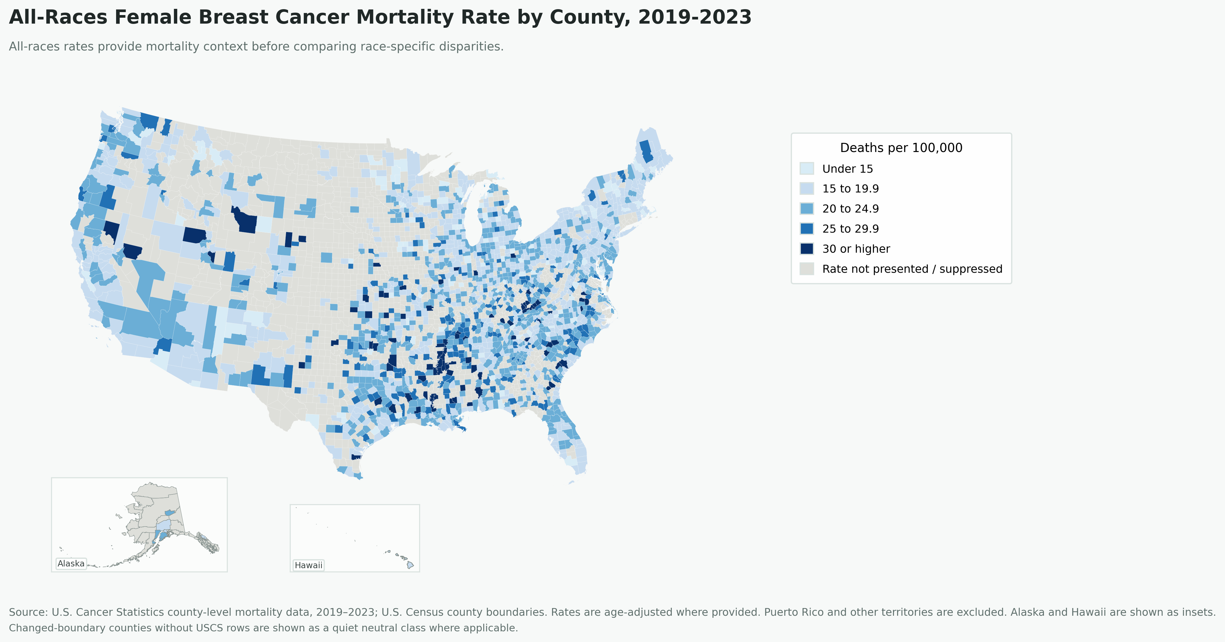
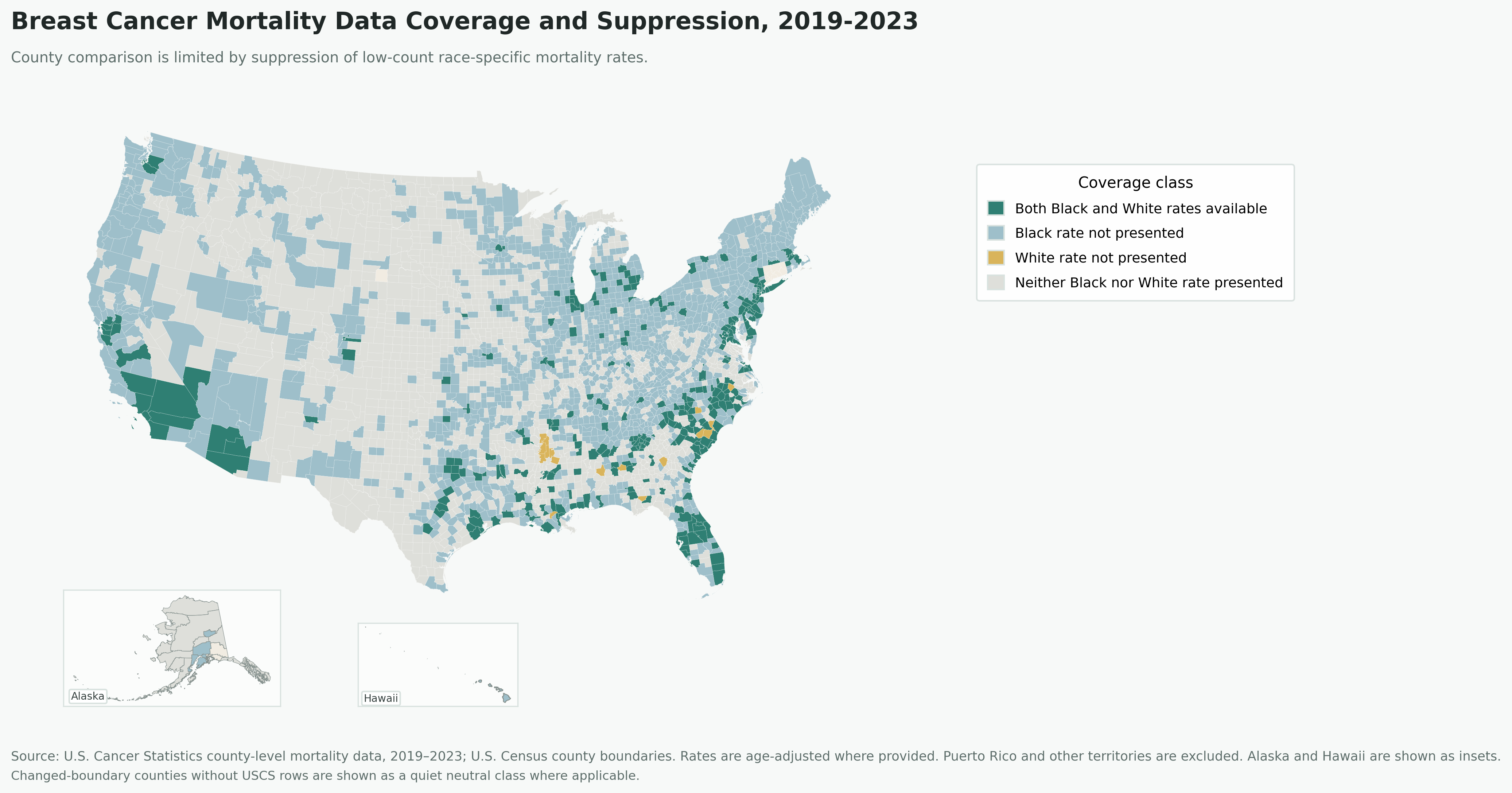
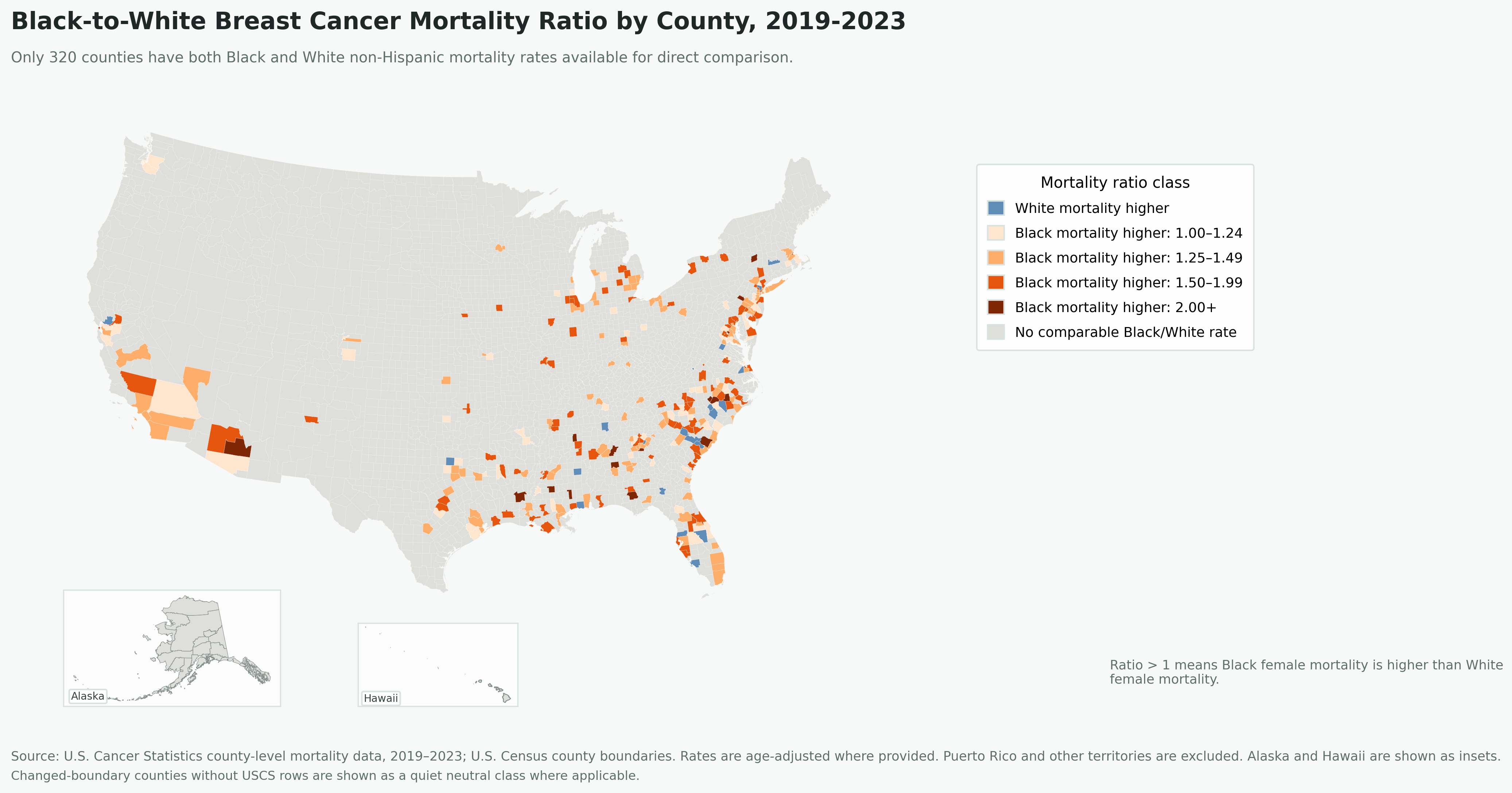
Decision value: This analysis can help identify where comparable county-level disparities are visible and where suppressed data limits interpretation.
Filter to comparable counties, calculate Black-to-White mortality ratios, map geographic variation, and review where race-specific suppression prevents direct comparison.
Suppression and county-level aggregation limit interpretation. The maps should be read as county-level screening tools for spatial pattern recognition, not as evidence of individual risk or causal pathways.
A future next step is to run and document a defensible spatial clustering workflow after the comparable-county dataset is finalized.
This project shows how disparity mapping must account for both visible mortality differences and the limits created by missing county-level values.
Windsor, Ontario | Environmental GIS | Urban forestry
This supporting GIS project uses a priority screening workflow to narrow a city-wide urban forestry question into planning-level candidate priority areas for further review.
Research question: Where should Windsor prioritize further review for new tree planting based on heat exposure, low existing tree density, and public/community benefit?
Context / why it matters: Urban trees can reduce heat stress, improve pedestrian comfort, support public health, and strengthen green infrastructure. This GIS suitability workflow helps narrow a city-wide problem into planning-level priority areas that can be reviewed through ownership checks, field verification, and community consultation.
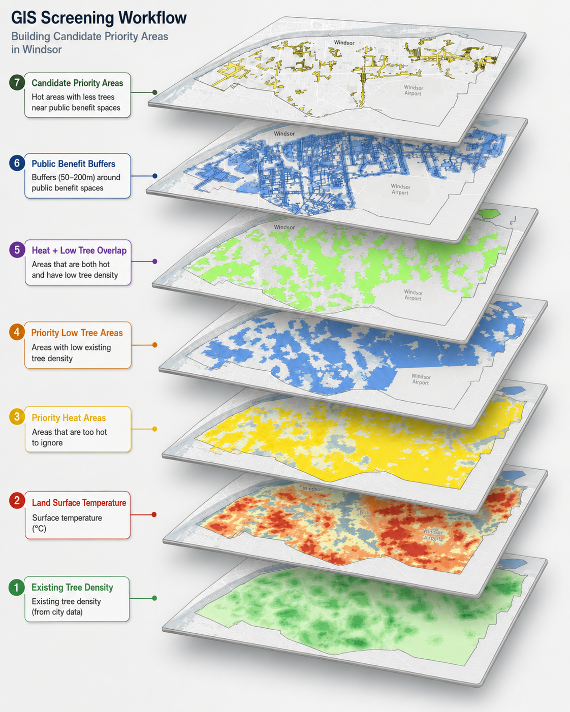
This visual sequence shows how the analysis moves from broad input layers to candidate priority areas. Each step adds one planning filter: heat exposure, existing tree density, public/community benefit, and further review.
Keep scrolling to see how each layer narrows the analysis.
1 / 7
High heat + low tree density + public/community benefit proximity = candidate priority areas for further review.
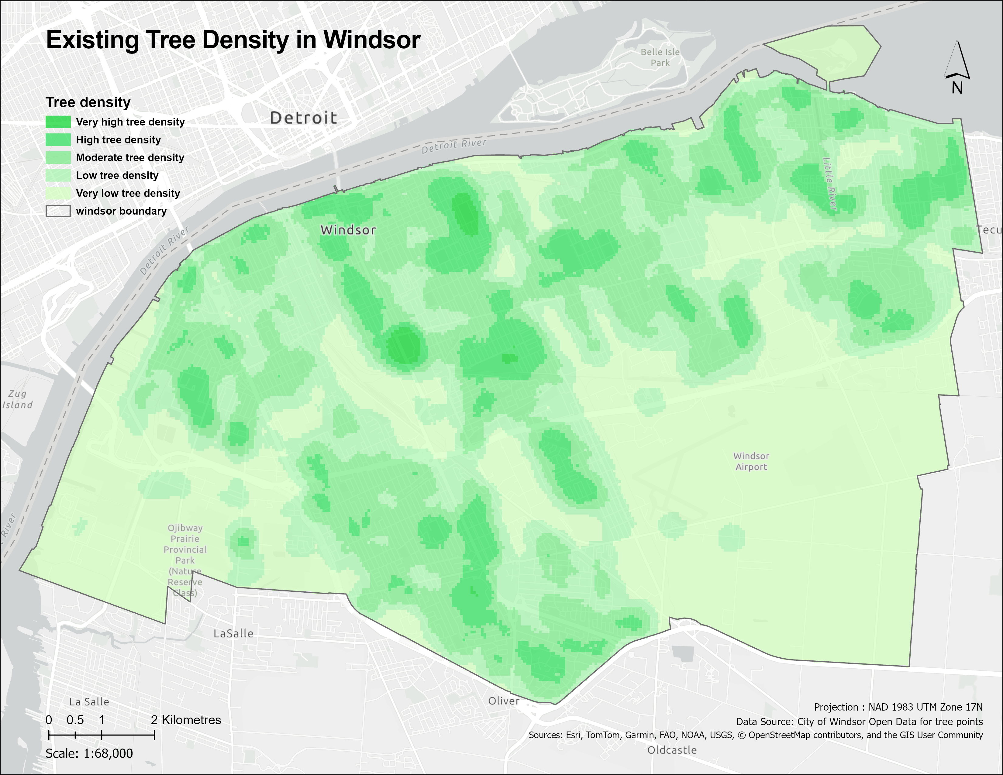
Question: Where are there fewer trees?
Right-of-way and park tree datasets were combined to show areas with lower existing tree density.
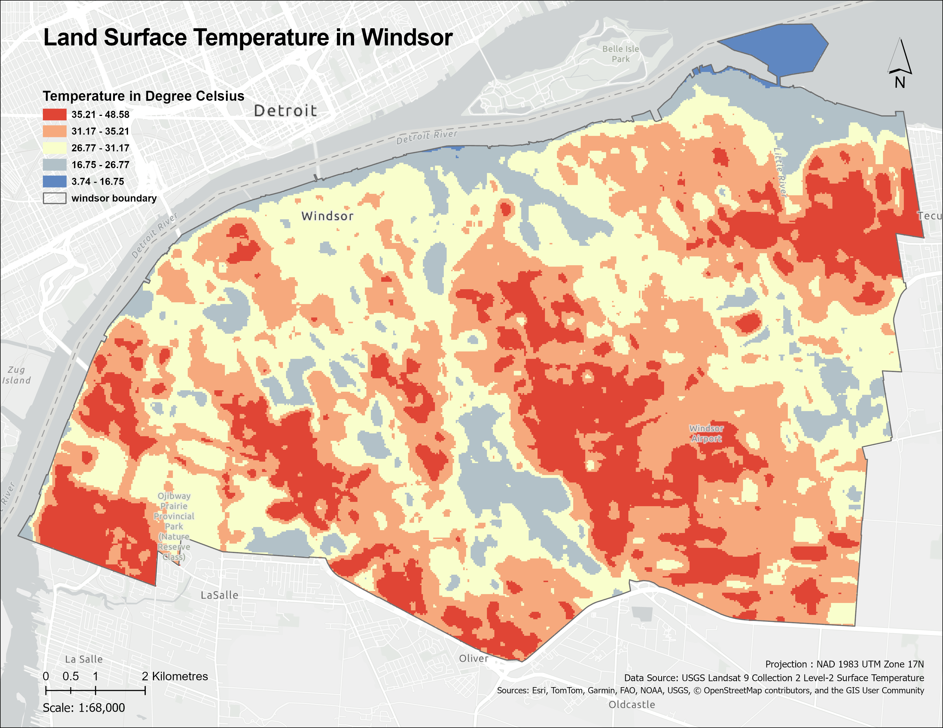
Question: Where is Windsor hotter?
Landsat surface temperature highlights city-scale heat patterns across Windsor.
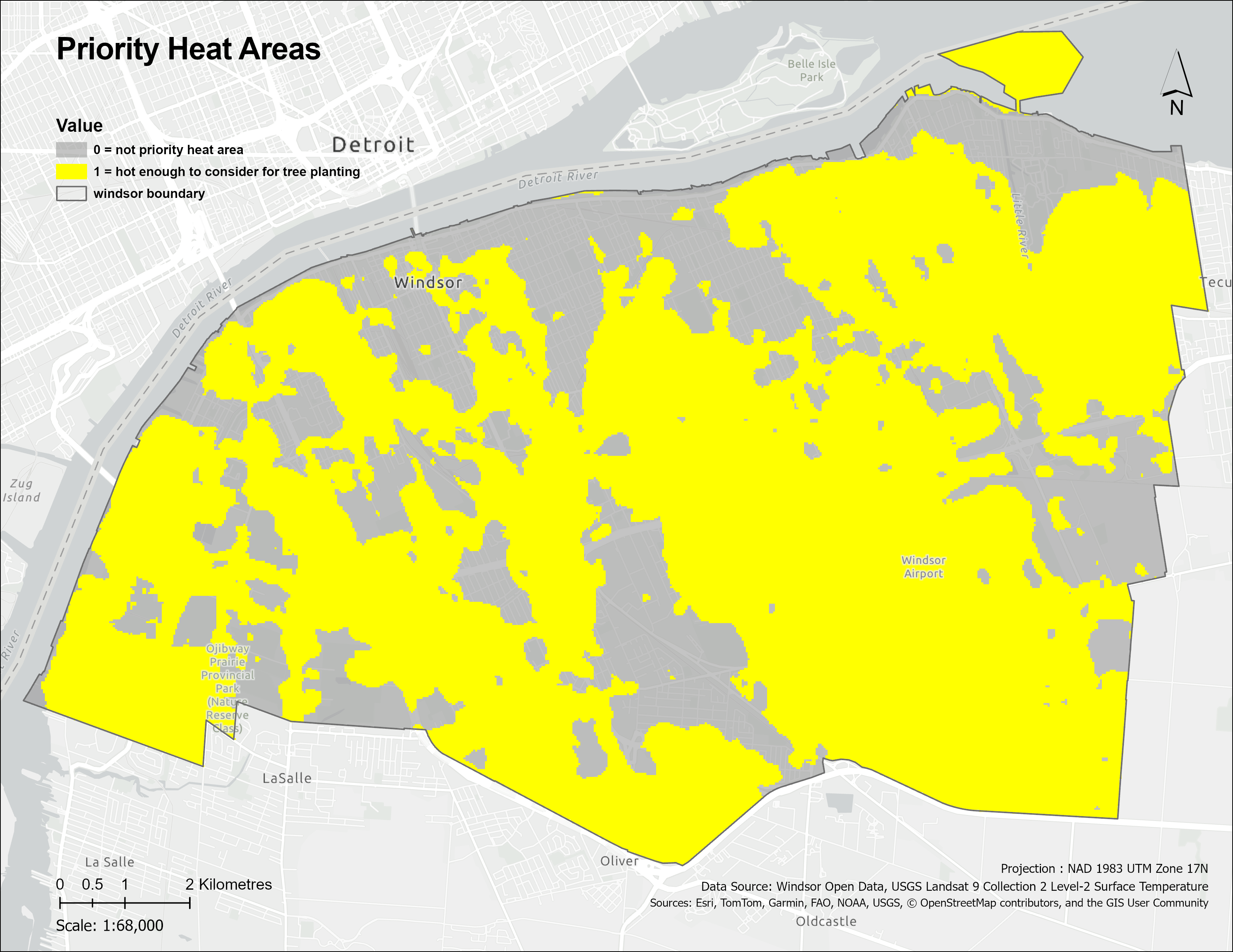
Question: Which areas are hot enough to screen further?
The hottest surface temperature classes were reclassified into a binary heat-priority layer.
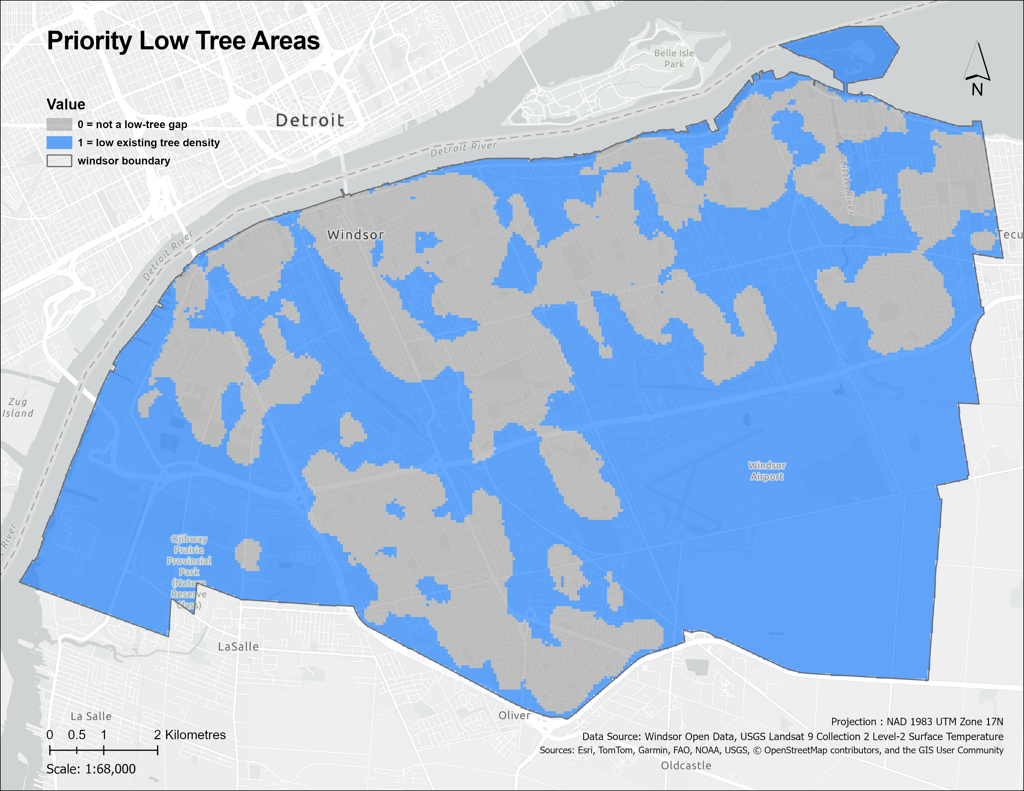
Question: Where does existing tree density suggest canopy need?
Lower tree-density areas were reclassified as priority areas for canopy improvement.
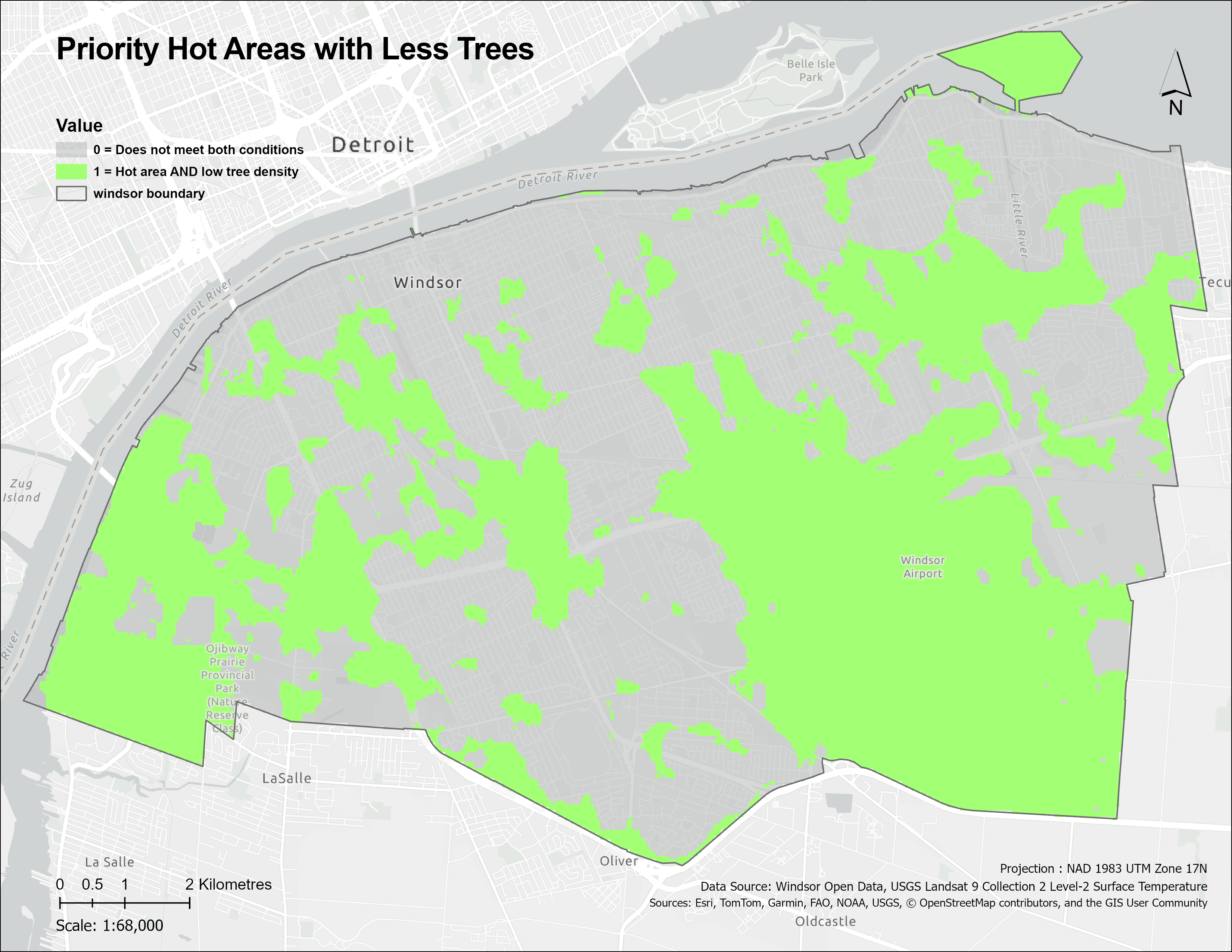
Question: Where do heat and canopy need overlap?
The heat-priority and low-tree-density layers were combined to keep only areas where both conditions were present.
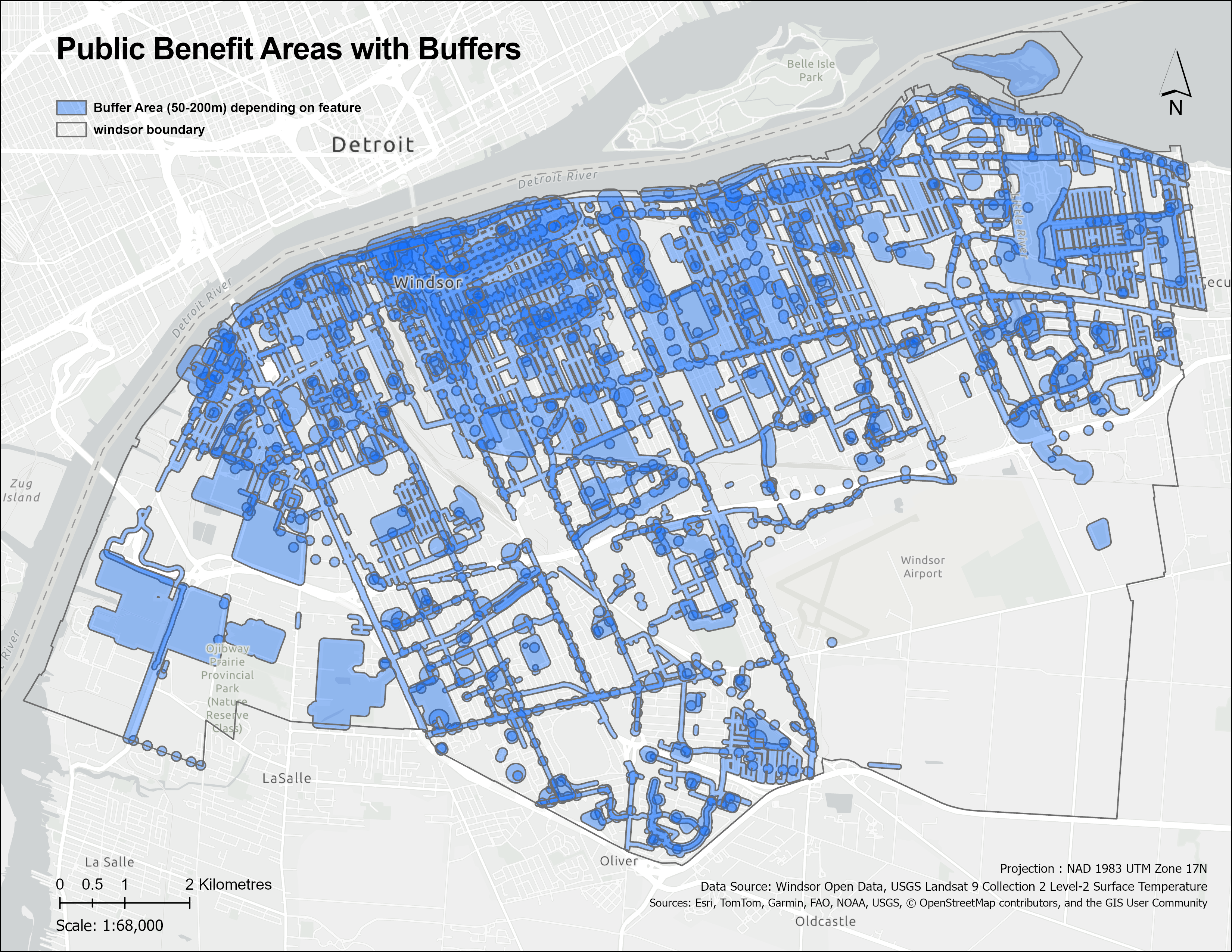
Question: Which priority areas are near public/community features?
Parks, schools, playgrounds, sidewalks, bus stops, and BIAs were buffered to estimate public/community benefit areas.
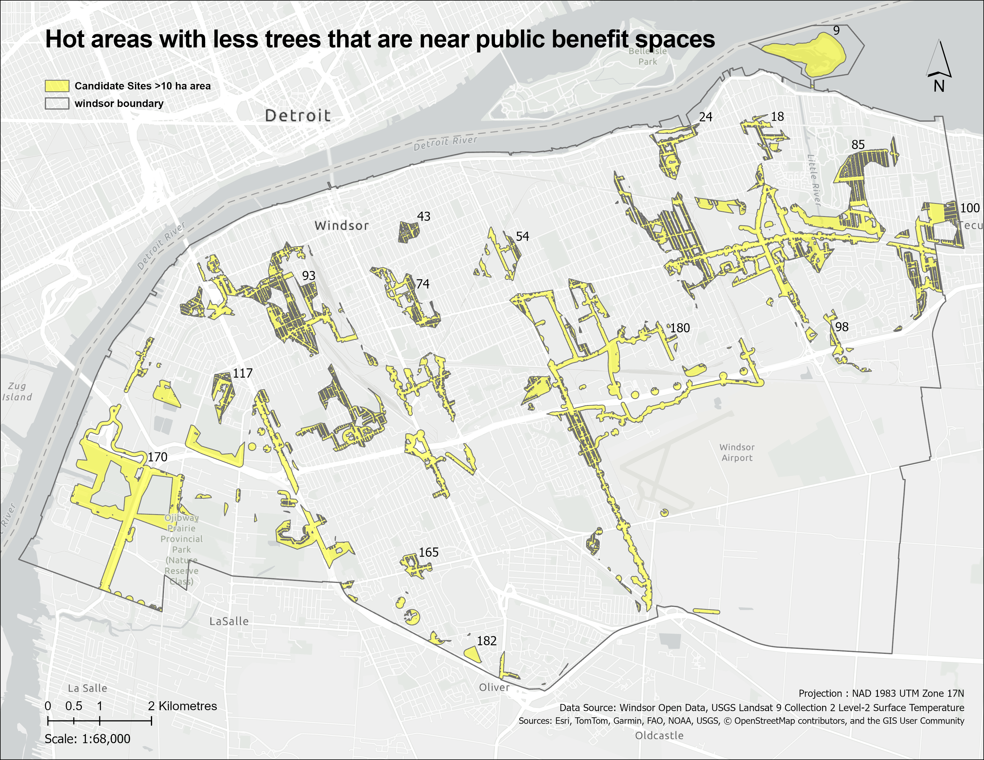
Question: Which areas remain after screening?
Hot, low-tree-density areas near public/community features were identified as candidate priority areas for further review.
On smaller screens, the Windsor workflow is shown as a step-by-step map sequence. Each map adds one planning filter and moves the analysis closer to candidate priority areas for further review.
Scroll through the maps to follow the screening logic.
1 / 7
Step 1 of 7
Question: Where are there fewer trees?
Step 2 of 7
Question: Where is Windsor hotter?
Step 3 of 7
Question: Which areas are hot enough to screen further?
Step 4 of 7
Question: Where does existing tree density suggest canopy need?
Step 5 of 7
Question: Where do heat and canopy need overlap?
Step 6 of 7
Question: Which priority areas are near public/community features?
Step 7 of 7
Question: Which areas remain after screening?
I built a GIS workflow to identify planning-level areas where high heat, low existing tree density, and public/community benefit overlap. These areas are candidates for field review, not selected planting locations.
The main output is a set of candidate priority areas for further review, not a planting plan.
The next step would be parcel ownership review, underground utility checks, field verification, municipal planting constraints, and community consultation before moving from screening results to planting decisions.